London Metro Map 2026: The Truth Behind the Tube (Fares, Zones, Hidden Traps)
The London Metro Map looks innocent—clean lines, calm colours, familiar names. But beneath that surface, something else is at work. In 2026, every curve and circle quietly influences what you pay, how long you wait, and which mistakes cost the most.
Read it one way, and the city drains your wallet. Read it another, and doors open—faster routes, cheaper fares, fewer surprises. Before stepping onto the platform, it’s worth knowing what the map isn’t telling you.
This is the fully updated London Metro Map guide for 2026. Not a poster. Not a tourist leaflet. A practical, street‑level explanation of what the map is really telling you—and what it isn’t.
The London Metro Map Isn’t Geographical (And That Changes Everything)
The first mistake almost everyone makes is assuming the London Metro Map reflects real distance.
It doesn’t.
The map is a schematic, originally designed in 1931 by Harry Beck. Stations that look close may be a 15‑minute walk apart. Others that look far are separated by a single 90‑second train ride.
Why this matters in 2026: fares, journey times, and even peak pricing are triggered by zones, not distance. Read the map wrong and you pay more for a slower journey.
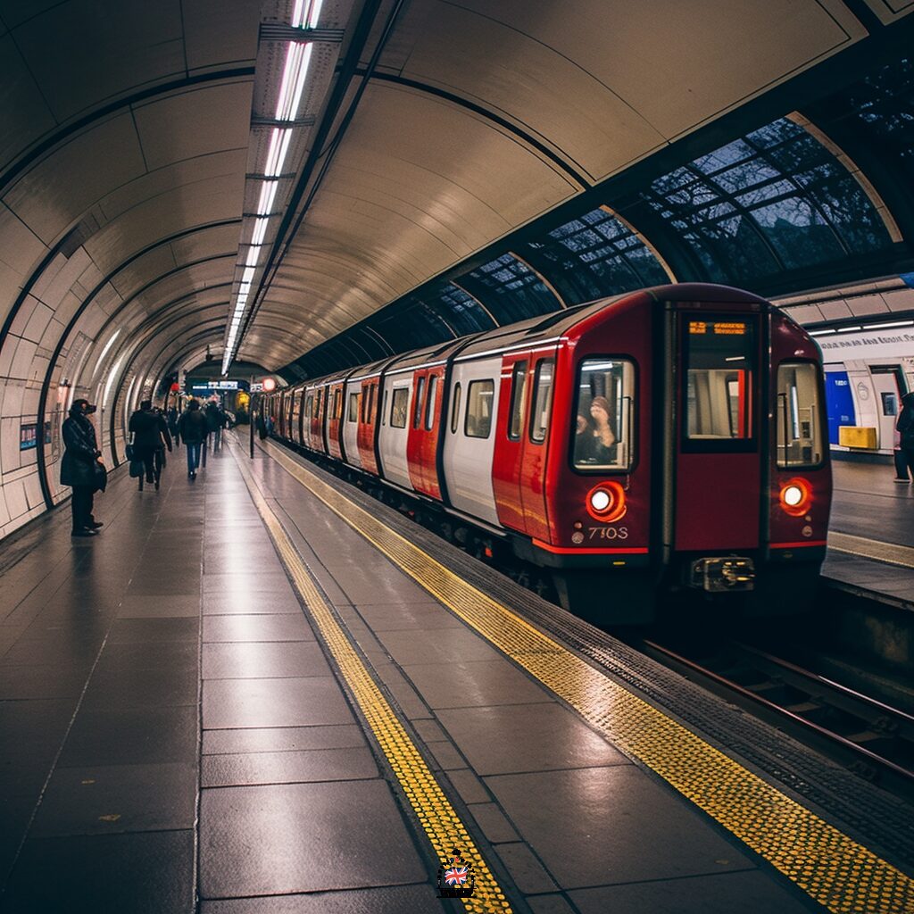
London Underground in 2026: The Numbers That Matter
Here’s the current reality of the London Underground as of January 2026:
- 11 Underground lines (plus Elizabeth line, Overground, DLR)
- 270+ stations across Greater London
- 9 fare zones (Zone 1 = central London)
- First trains: around 05:00 (07:00 Sundays)
- Last trains: around midnight (Night Tube on selected lines Fri–Sat)
By the end of 2026, 100% of the Tube network is expected to have 4G/5G mobile coverage, including tunnels—a change already live on the entire Elizabeth line and over half of underground stations.
London Metro Fares 2026: What You Actually Pay
This is where the map quietly controls your wallet.
As of March 2026, individual Tube fares increased slightly, but daily caps remain frozen.
- Zone 1 only: £3.10 peak / £3.00 off‑peak
- Zones 1–2: £3.60 peak / £3.10 off‑peak
- Zones 1–6: £5.90 peak / £4.00 off‑peak
- Daily cap (Zones 1–2): typically £8.50–£8.90
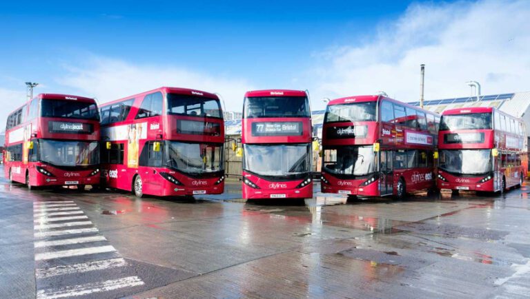
Bus fares remain frozen at £1.75 per journey until at least July 2026, with unlimited transfers within one hour (the Hopper fare).
Translation: the map helps you decide when walking one stop or switching lines saves real money.
London Metro Map (Official PDFs)
London Metro General Map
This is the full official Tube map showing every station and connection.
London Metro Bicycles Map
Where cycles are allowed on the Tube (and when). In 2026, non‑folding e‑bikes are banned on most TfL services.
London Metro Toilet Facilities Map
One of the most underrated maps on the network. Toilets are free, but unevenly distributed—scarce in Zone 1, plentiful further out.
The Hidden Rule the Map Never Tells You
If two stations look close on the map, check walking time before tapping in.
Examples locals use daily:
- Leicester Square ↔ Covent Garden: 4‑minute walk, often 15 minutes by Tube
- Charing Cross ↔ Embankment: connected underground
- Bank ↔ Monument: same station, different name
The map hides this on purpose—to keep it readable. Knowing it changes how you move.
Frequently Asked Questions (2026)
Is there an official London Metro app?
Yes. TfL Go offers live disruptions, offline maps, and step‑free routing.
Can I bring a bicycle on the Tube?
Folding bikes: always allowed. Non‑folding bikes: limited lines and off‑peak only. Non‑folding e‑bikes: mostly banned as of 2025.
Is the Tube cheaper than taxis?
Almost always. A £3.10 Zone 1 journey replaces a £12–£20 taxi ride.
The Map, Revisited
Once you understand the London Metro Map, it stops being a diagram and becomes a strategy.
It tells you when to walk, when to switch, when to wait, and when not to tap in at all.
Most people never learn this.
Now you have.